Flexi Bond

Project Overview
Flexibond is an established architectural surface and building-material brand that began manufacturing Aluminium Composite Panels in 2002. Over the years, its portfolio expanded into Acrylic surfaces, PVC/WPC Foam Boards, WPC Solid Doors & Frames, PVC Laminates and Soffit Ceiling & Wall Systems, serving architects, designers, builders and the broader construction industry.
The client needed a stronger and more consistent visual system for communicating this broad product ecosystem across corporate brochures, catalogues, stationery and sales presentation material. The design needed to represent Flexibond as an experienced, technically capable and premium architectural-material brand rather than appearing like conventional industrial communication.
Our objective was to translate the company’s core philosophy of Precision + Perfection = Excellence into a clean, contemporary and professional design language capable of supporting both corporate communication and product-focused sales material.
The Challenge
Flexibond had evolved from an ACP manufacturer into a broader architectural materials company with several very different product families. Each category has its own colours, finishes, textures, technical features and applications, creating a challenge in presenting the range without allowing brochures and sales collateral to feel disconnected or visually inconsistent. The corporate identity needed to remain recognizable regardless of which product was being discussed.
Another challenge was balancing technical information with premium presentation. Architects, contractors and dealers need practical product details, whereas brand communication also needs to communicate inspiration, quality and design possibilities. Dense specifications could easily make catalogues appear industrial, while an overly visual approach could reduce their usefulness as professional sales tools.
The design system also needed to work across different physical and digital formats—from stationery and folders to large product catalogues and corporate presentations. Maintaining hierarchy, typography and brand consistency across all these touchpoints was essential.

Our Solution
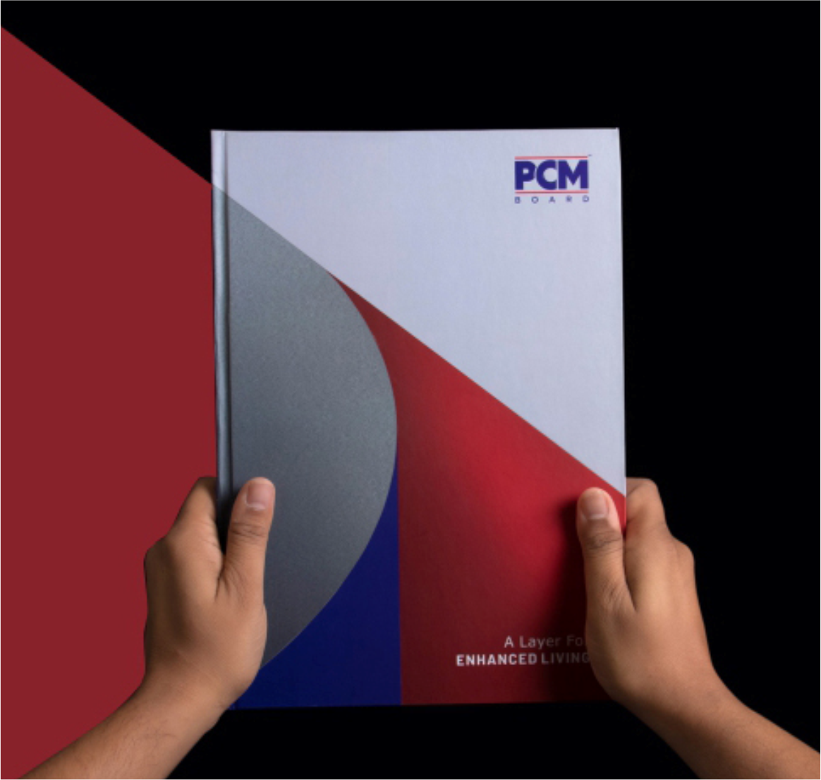
We developed a structured and minimal corporate visual language built around Flexibond’s established blue, red and white brand palette. Clean geometric compositions, generous white space and controlled typography create a professional architectural feel, while dynamic red-and-blue graphic forms introduce energy without overwhelming the product information.
For brochures and catalogues, we developed a flexible editorial grid that gives product imagery and material textures strong visual priority while keeping technical content organized into clear sections. This allowed different surfaces—metallic ACP, acrylic, PVC/WPC and other architectural materials—to retain their own visual personality while still appearing within one recognizable Flexibond brand family.
The same visual principles were extended across stationery, presentation folders, bags and corporate collateral, creating consistency from the first client presentation through detailed product selection. The result was not simply a collection of individual designs, but a scalable communication system that supports Flexibond’s sales, dealer and professional presentation requirements.
A closer look at the experience.


Let’s Build What’s Next.
Whether you’re building a new brand, improving your digital experience, scaling eCommerce, driving growth, automating operations, or solving a technology challenge, let’s talk about where you want to go—and what it will take to get there.