
Heeva

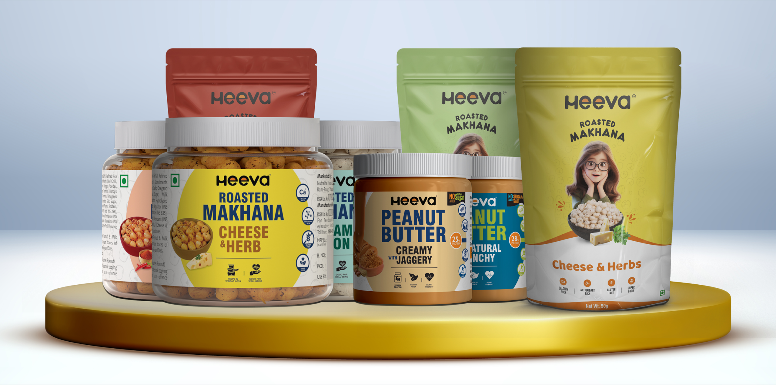
Project Overview
Heeva is a growing Indian food and beverage brand built around the idea that everyday food should be both nutritious and enjoyable. Its portfolio extends across categories such as peanut butter, roasted flavoured makhana, breakfast cereals, honey, roasted nuts, sauces and cold-pressed oils.
The client needed a packaging identity capable of communicating health, taste, quality and happiness while remaining flexible enough to work across very different food categories. A cereal box, peanut butter jar, makhana pouch and honey pack each require a different visual treatment, yet all of them still needed to feel unmistakably part of the Heeva brand.
Our objective was therefore to create packaging that could strengthen shelf presence, simplify product recognition and turn Heeva’s broad portfolio into one cohesive and memorable consumer brand.
The Challenge
Heeva operates across multiple FMCG categories, each with its own consumer expectations and competitive landscape. Breakfast cereals need to feel energetic and exciting, healthy snacks must communicate taste without losing their better-for-you positioning, while products such as honey require a more natural and premium expression. The key challenge was building enough flexibility for every category while ensuring the overall portfolio did not feel like a collection of unrelated brands.
The packaging also needed to stand out in visually crowded retail environments. Customers often make food choices within seconds, so flavour, product type and key benefits had to be immediately understandable. At the same time, the design needed sufficient space and hierarchy for ingredients, nutrition, pack information and other essential FMCG communication without overwhelming the front of the pack.
Another important requirement was creating an emotional connection around Heeva’s core idea of happiness. Instead of developing packaging that looked overly clinical or health-focused, the client needed a visual language that could communicate wholesome nutrition with flavour, energy and enjoyment.

Our Solution
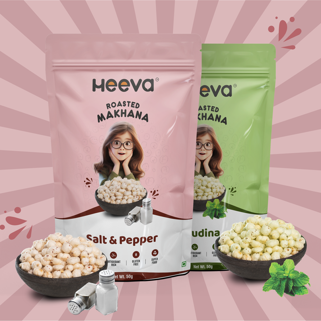
We developed a flexible packaging language centred around bright visual storytelling, strong product recognition and category-specific personality. The Heeva identity remains consistent across the portfolio, while colour, typography, imagery and graphic elements are adapted according to the product experience. This allowed lively categories such as breakfast cereals to use brighter colours and playful illustrations while more premium products could adopt a refined and sophisticated presentation.
For products with multiple flavours and variants, we created a clear SKU differentiation approach so customers could recognise both the master brand and the individual flavour quickly. Product imagery and appetite cues were given strong visual priority, while the information hierarchy was organised around the brand, product name, flavour, key proposition and essential pack communication.
The resulting system was designed to scale across boxes, jars, pouches and other packaging formats without losing consistency. By balancing playful consumer appeal with quality and natural-food cues, we transformed packaging into an important brand-building tool rather than simply a container for the product.
A closer look at the experience.

Let’s Build What’s Next.
Whether you’re building a new brand, improving your digital experience, scaling eCommerce, driving growth, automating operations, or solving a technology challenge, let’s talk about where you want to go—and what it will take to get there.