Atop
Project Overview
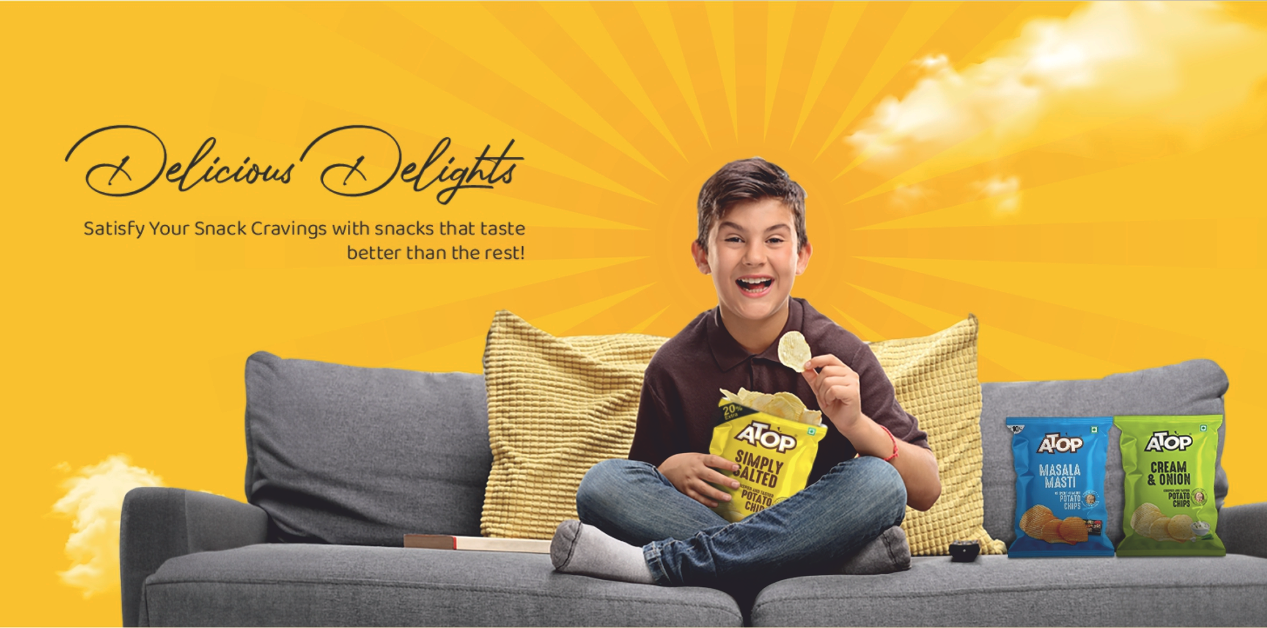
Atop Food Products Pvt. Ltd. is an established FMCG snack manufacturer offering a broad portfolio across potato chips, namkeen, extruded snacks, fryums and sweets. The company positions quality and manufacturing technology as important strengths, using automated production and packaging systems designed to preserve product taste and freshness.
For this packaging project, the focus was on giving Atop’s contemporary snack products a stronger identity for a younger, impulse-driven consumer audience. Products such as 2 in 1 Masala Munchies and Fingers needed packaging that could instantly communicate crunch, flavour and fun while competing effectively in a highly colourful snack aisle.
The objective was therefore to create a packaging system that felt energetic and modern, improved product recognition from a distance, and remained unmistakably part of the Atop brand as new flavours and snack formats were introduced.
The Challenge
The Indian packaged-snack category is one of the most visually competitive FMCG environments. Bright colours, bold typography and large food imagery are common across almost every brand, making differentiation difficult. For Atop, the challenge was to create packs that delivered the expected sense of taste, crunch and excitement without blending into the surrounding category.
The products also needed to appeal strongly to younger consumers. As seen in the supplied designs, products such as Munchies and Fingers have very different shapes and personalities, so each SKU required enough individuality to be quickly recognizable. At the same time, designing every product independently would weaken overall Atop recognition, meaning we needed to balance individual product personality with a consistent master-brand system.
Finally, snack packaging has only a few seconds to communicate. Brand, product name, flavour, product photography, weight, key claims and statutory information all compete for limited pouch space. Creating a clear hierarchy while preserving strong shelf impact was therefore central to the design challenge.
Our Solution
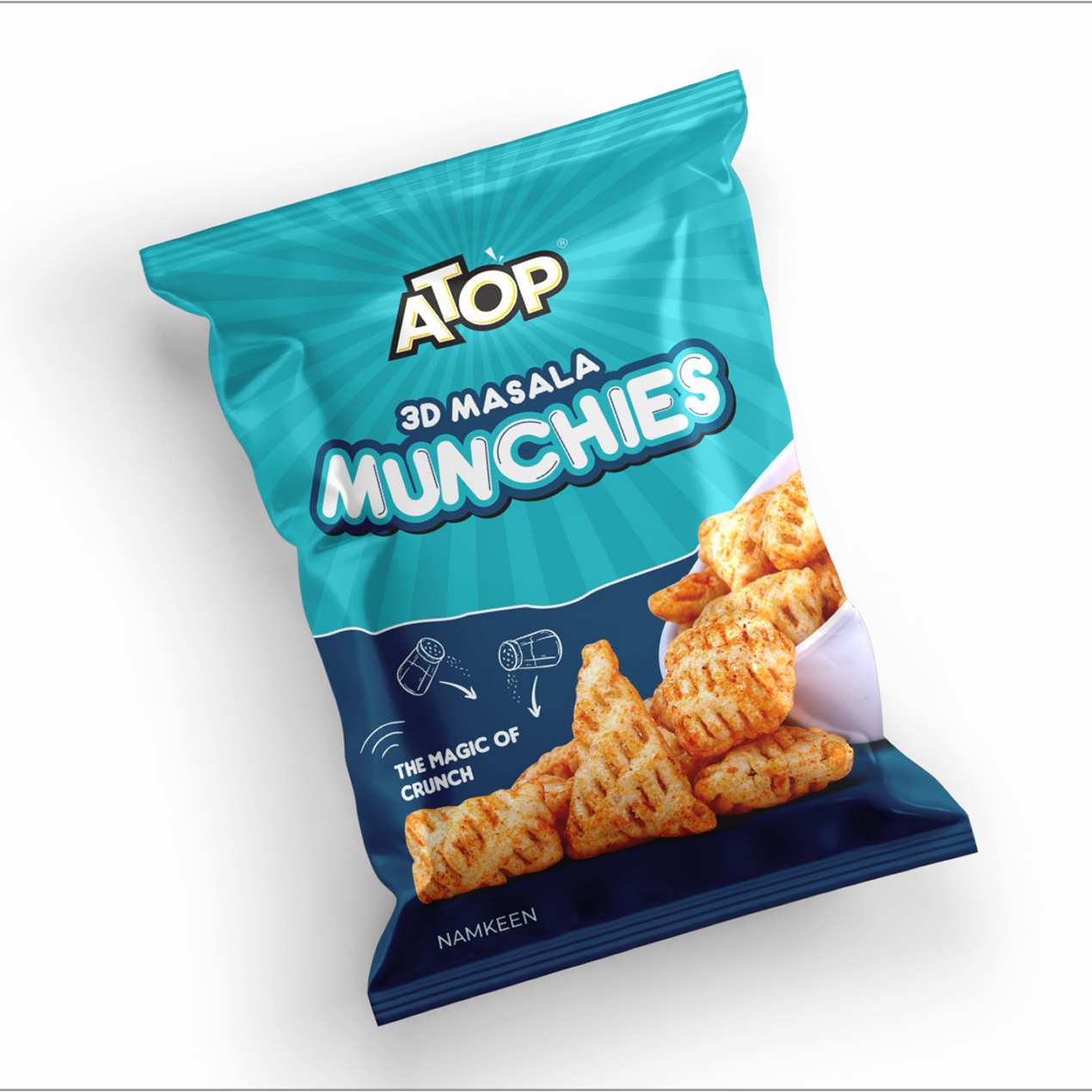
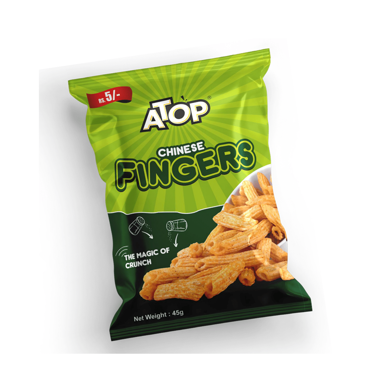
We developed a bold, high-energy visual system built for instant shelf recognition. Strong colour blocking gives each product an immediate personality—the vibrant cyan direction for 2 in 1 Masala Munchies and energetic green treatment for Fingers create clear visual differentiation while keeping the Atop identity consistently positioned across the range.
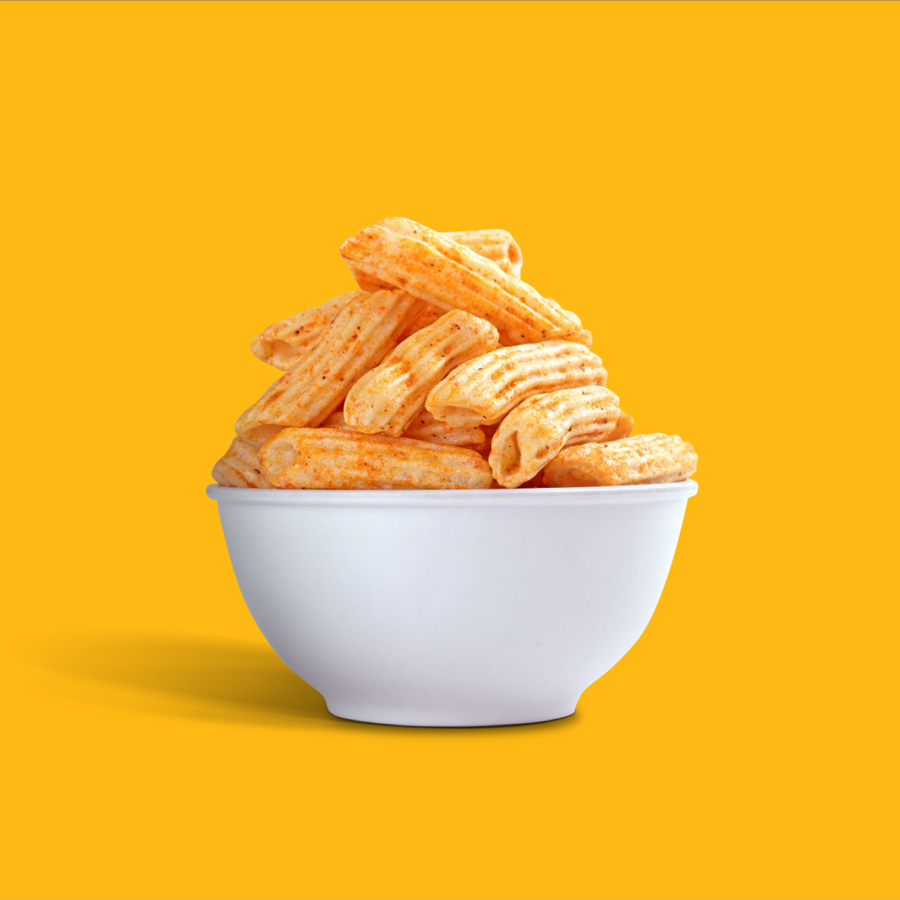
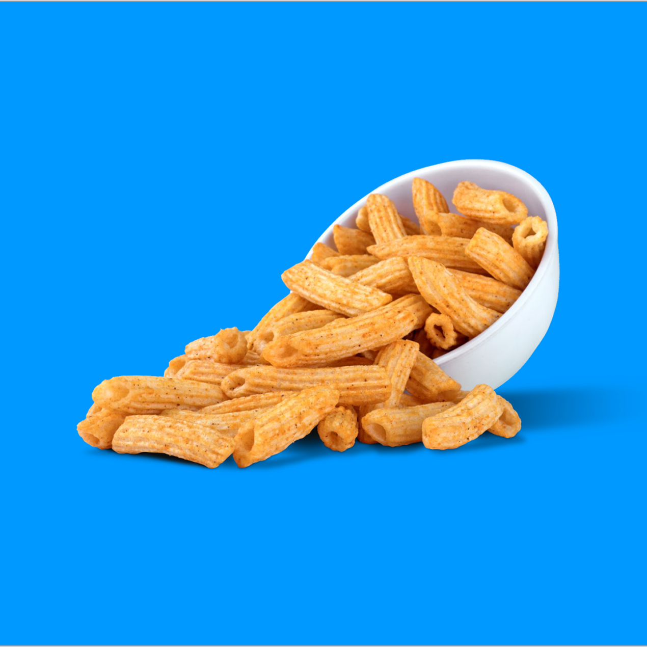
The product names were treated as major visual assets rather than secondary label information. Large typography, close-up crispy snack imagery and playful supporting graphics communicate the product experience almost instantly. The Munchies design uses youthful illustrative elements and a more dynamic visual language, while the Fingers pack uses stronger ingredient and product imagery to reinforce its distinctive snack shape and crunchy character.
We also developed the system with future expansion in mind. By maintaining consistent principles for logo placement, product naming, food imagery and information hierarchy, Atop can introduce additional flavours and snack formats through new colour and flavour cues without rebuilding the entire packaging identity. This creates a scalable system suitable for retail shelves, distributor displays and digital product communication.
A closer look at the experience.
Let’s Build What’s Next.
Whether you’re building a new brand, improving your digital experience, scaling eCommerce, driving growth, automating operations, or solving a technology challenge, let’s talk about where you want to go—and what it will take to get there.