
Bikanervala


Project Overview
Bikanervala is one of India’s most established food brands, with roots dating back to 1905 and a presence that has expanded to 200+ outlets across India and several international markets. While the brand is traditionally known for Indian sweets, snacks and vegetarian food, its long-standing reputation also provides a powerful foundation for introducing products aimed at changing consumer tastes and modern eating habits.
For this project, our focus was the Bikanervala Peanut Butter range. The objective was to create packaging that could extend Bikanervala’s recognizable brand equity into a contemporary spread category while appealing to consumers looking for convenient, nutritious and indulgent everyday foods.
The packaging needed to feel unmistakably Bikanervala, but not look like traditional mithai or namkeen packaging. It required its own modern FMCG personality while retaining enough visual connection to the parent brand to benefit from decades of familiarity and trust.
The Challenge
The biggest challenge was introducing Bikanervala into a product category with a very different visual language from its traditional food portfolio. Peanut butter is commonly associated with fitness, breakfast, nutrition and modern convenience, while Bikanervala carries strong associations with Indian heritage foods. The packaging therefore needed to bridge these two worlds—keeping the brand recognizable while giving the product a younger, contemporary and category-relevant personality.
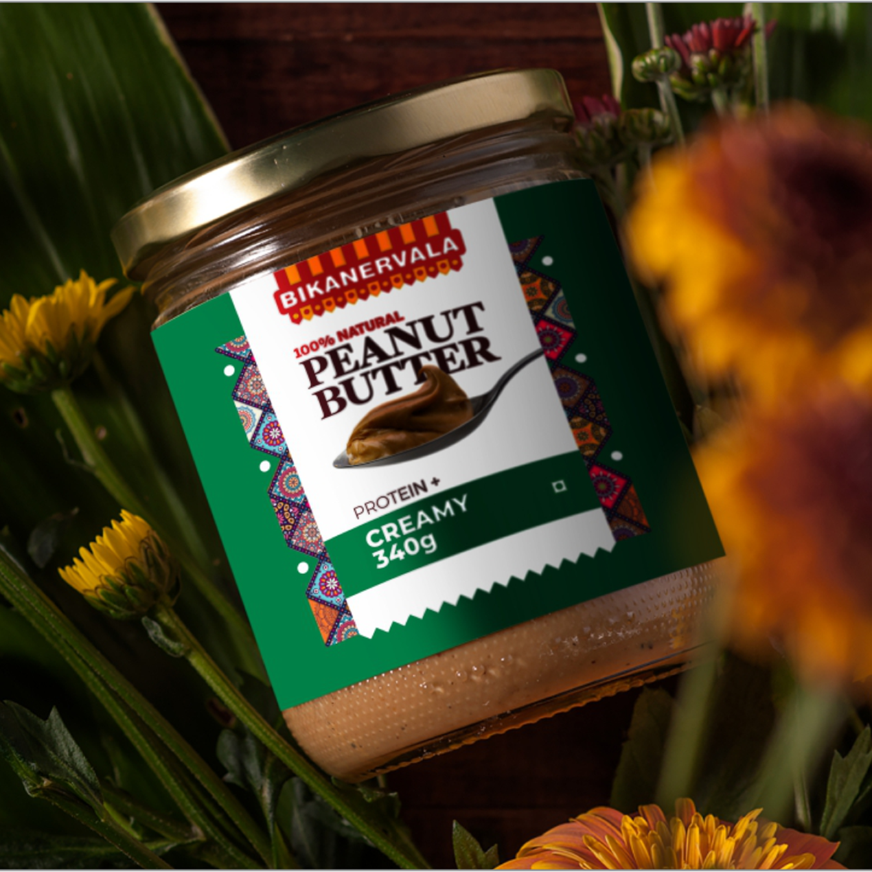
A second challenge was creating clear differentiation between multiple peanut butter variants. As seen in the supplied designs, products such as Creamy and Chocolate needed to be identified within seconds while appearing together as one cohesive family. Colour coding had to be prominent enough for quick recognition without overpowering the established Bikanervala red-and-yellow identity.
The design also had to handle several communication priorities simultaneously: brand name, Peanut Butter category, flavour/variant, product imagery, nutritional communication, weight and statutory information. Organising these elements into a strong hierarchy was essential to prevent the jar from appearing crowded.


Our Solution
We developed a bold packaging system that combines Bikanervala’s heritage with a more modern FMCG aesthetic. The existing Bikanervala logo remains highly visible at the top, establishing instant trust, while oversized PEANUT BUTTER typography gives the new product category clear priority. Peanut and spread imagery create immediate appetite appeal and help customers understand the product without depending on lengthy communication.
A strong colour-coded architecture was introduced for SKU differentiation. Yellow, deep brown/red and green treatments give individual variants their own identities while the consistent white label structure, logo position and decorative borders maintain family recognition. The Indian-inspired patterned side elements subtly connect the new packaging back to Bikanervala’s cultural heritage without making the product feel traditional or dated.
The final system was designed to scale across future flavours and formulations. By maintaining a fixed master layout and changing selected colour, flavour and product cues, Bikanervala can expand the peanut butter portfolio while preserving a consistent and recognizable shelf presence.
A closer look at the experience.

Let’s Build What’s Next.
Whether you’re building a new brand, improving your digital experience, scaling eCommerce, driving growth, automating operations, or solving a technology challenge, let’s talk about where you want to go—and what it will take to get there.