
Country Farms

Project Overview
Country Farms is a peanut butter and health-food manufacturer focused on combining quality ingredients, flavour and nutrition. Its wider portfolio includes creamy and crunchy peanut butter, natural and jaggery variants, high-protein formulations, chocolate flavours and premium nut spreads. The company also serves private-label and third-party food brands with customised formulations and packaging support.
For the ButterNutt packaging project, the objective was to build a more contemporary consumer-facing identity around the peanut butter range. The product needed to feel appetising and approachable while retaining the health, nutrition and farm-sourced associations of the Country Farms master brand.
The packaging therefore had to do more than carry product information. It needed to create a recognizable visual family across multiple variants and turn each peanut butter jar into a stronger retail brand asset.
The Challenge
The peanut butter category is visually competitive, with many products using the same brown palettes, peanut imagery and fitness-oriented messaging. The client needed a packaging identity that would still communicate authentic peanut flavour and nutritional value, but look cleaner, younger and more distinctive than conventional peanut butter packaging.
Another major challenge was SKU differentiation. Country Farms manufactures multiple peanut butter formulations—including creamy, crunchy, natural, jaggery, high-protein, sugar-free and flavoured options. The packaging system therefore needed enough consistency to build one recognizable brand while allowing each variant to develop its own visual personality.
The pack also had to balance appetite appeal with important FMCG information such as product name, flavour, ingredients, net weight, nutritional details and regulatory communication. Creating this hierarchy without making the jar look overloaded was essential to achieving a more premium shelf presence.
Our Solution
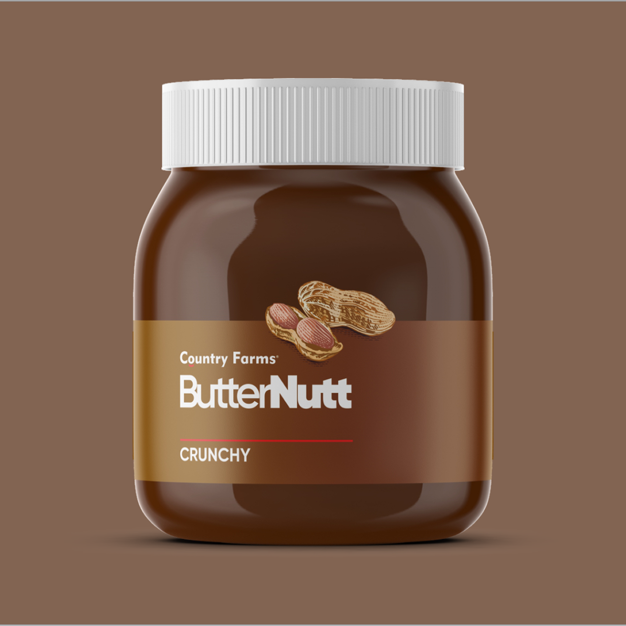
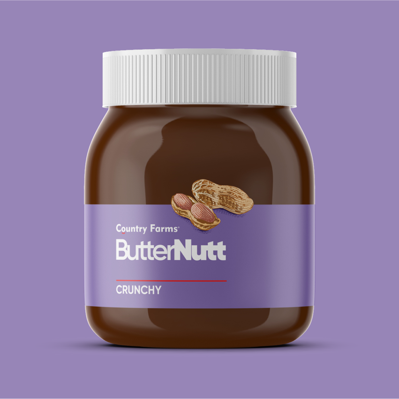
We developed a minimal, modern and product-led packaging identity around the ButterNutt name. As visible in the supplied concepts, a clean typographic system, simplified peanut illustration and uncluttered label composition give the jars a contemporary appearance while keeping the peanut ingredient immediately recognizable. The transparent/brown product body itself becomes part of the visual presentation rather than being hidden behind excessive graphics.
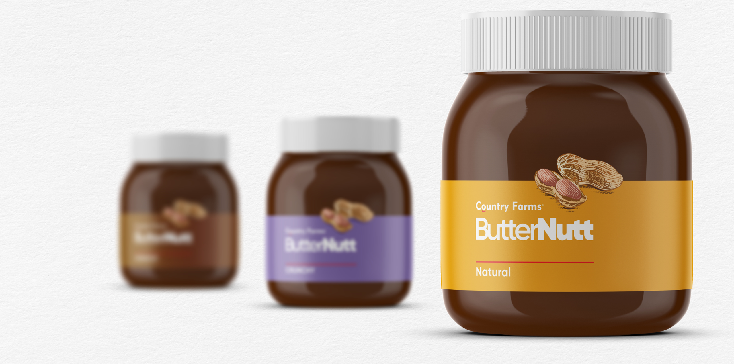
A flexible colour-coded SKU system was introduced to differentiate products while maintaining the same core architecture. Warm peanut and caramel-inspired tones create natural appetite appeal, while contrasting colours—such as the lilac treatment visible in the range—give individual formulations stronger recognition. Repeating the same logo position, typography and jar format ensures the entire family remains cohesive when several products appear together.
The resulting system was designed for scalability. New creamy, crunchy, chocolate, high-protein or speciality variants can be introduced by evolving the colour and flavour cues without rebuilding the complete packaging structure. This gives Country Farms a consistent identity that works across retail shelves, e-commerce product imagery and future product extensions.
A closer look at the experience.
Let’s Build What’s Next.
Whether you’re building a new brand, improving your digital experience, scaling eCommerce, driving growth, automating operations, or solving a technology challenge, let’s talk about where you want to go—and what it will take to get there.