
Maps Granito

Project Overview
Maps Granito is a ceramic surface manufacturer built around the combination of technology, craftsmanship, design and durability. The company manufactures vitrified and glazed porcelain products for residential and commercial applications and uses Italian SACMI technology as part of its production ecosystem. Its product communication targets architects, interior designers, dealers, distributors and international buyers looking for both visual variety and technical reliability.
The brand’s portfolio extends beyond conventional tiles into 60×60 and 60×120 glazed porcelain, large slabs, wood-look 200×1200 mm surfaces, 2 cm outdoor tiles, SPC wooden flooring and 800×1600 mm GVT, creating a need for a visual system capable of presenting very different material families under one recognizable identity.
Our objective was to translate this broad product ecosystem into a more sophisticated physical brand experience—one where packaging, catalogue presentation and product communication reflect the same sense of precision, modern architecture and premium surface design found in the products themselves.
The Challenge
Maps Granito offers a large and visually diverse surface portfolio, with designs ranging from marble and stone interpretations to wood, outdoor surfaces and large-format slabs. The primary challenge was creating a unified visual language without making every collection look identical. Architects and designers needed each surface family to retain its own personality, while dealers and distributors still needed to recognize the Maps Granito master brand immediately.
Another challenge was balancing visual inspiration with technical information. Tile and surface communication often needs to include collection name, dimensions, finish, application, product code and specifications, but presenting all of this too prominently can make packaging or catalogues feel industrial and cluttered. The design therefore needed to remain refined while still functioning as a practical product-selection resource.
Because Maps Granito also positions itself toward domestic and global markets, the system needed to feel internationally relevant and flexible enough to support future collections, additional formats and export communication.

Our Solution
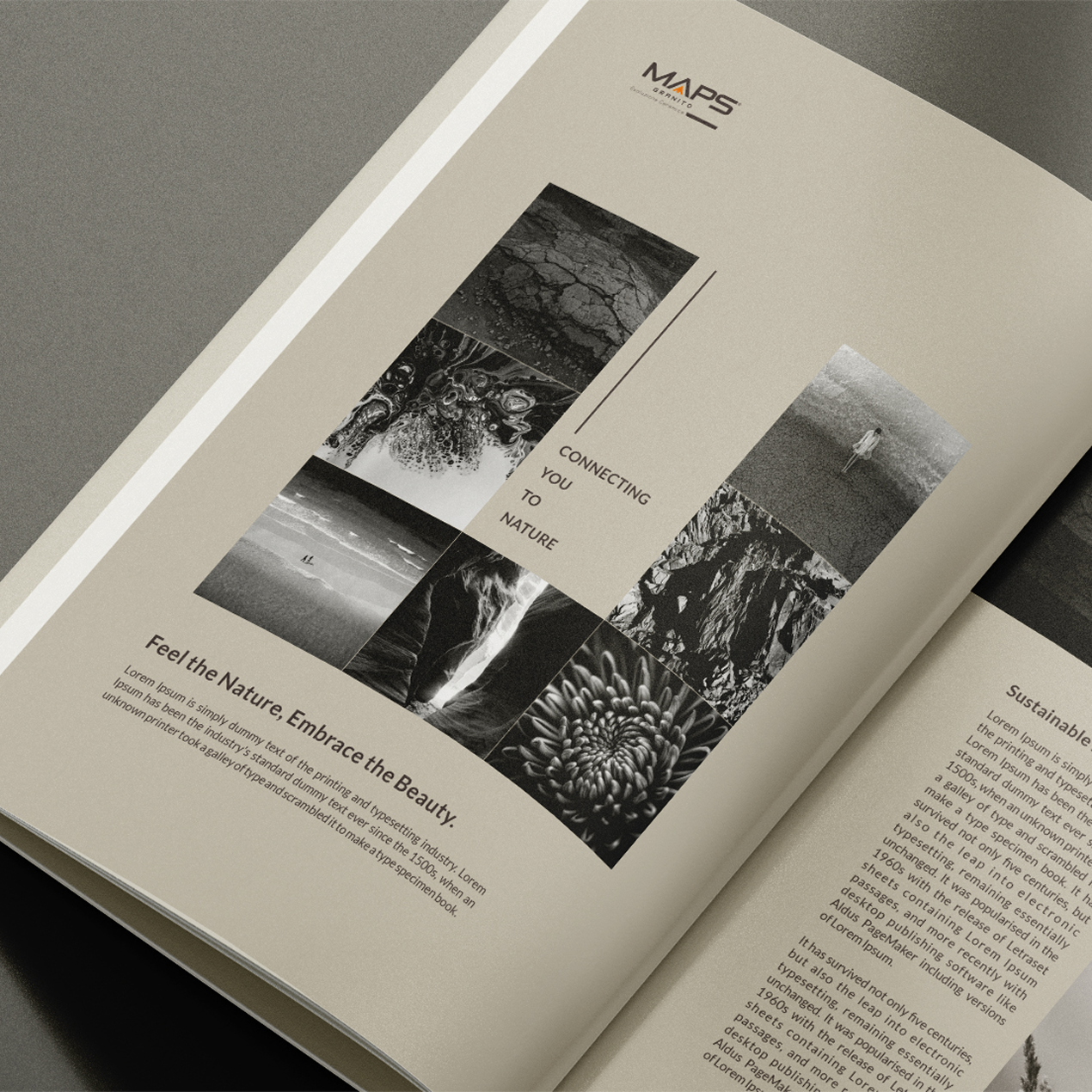
We developed a minimal, editorial and architecture-focused visual system that gives the ceramic surfaces maximum priority. As reflected in the supplied design, generous white space, restrained typography, neutral tones and large product imagery create a sophisticated presentation where the material becomes the hero instead of competing with excessive decoration.
A modular layout structure was introduced to organise brand identity, collection storytelling, product imagery and technical information into predictable zones. This creates visual consistency across the portfolio while allowing marble, stone, wood, outdoor and slab collections to use their own textures, photography and design narratives.
The system was also developed for scalability. Rather than designing every new collection from the beginning, Maps Granito can extend the same core visual language across future packaging, catalogues and product collateral—creating stronger consistency across architects, dealers, exhibitions, sales presentations and international markets.
A closer look at the experience.


Let’s Build What’s Next.
Whether you’re building a new brand, improving your digital experience, scaling eCommerce, driving growth, automating operations, or solving a technology challenge, let’s talk about where you want to go—and what it will take to get there.