
Lioli
Project Overview
Lioli is a premium porcelain surface manufacturer known for pioneering large-format slabs in India, including 1600 × 3200 mm porcelain surfaces. Its portfolio serves kitchens, countertops, walls, flooring, bathrooms, commercial spaces and other architectural applications, combining contemporary aesthetics with durability and advanced manufacturing.
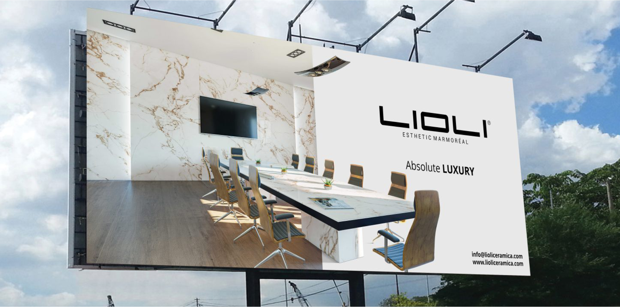
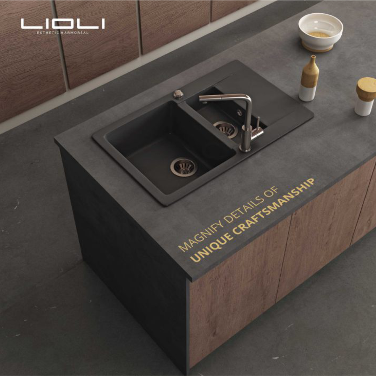
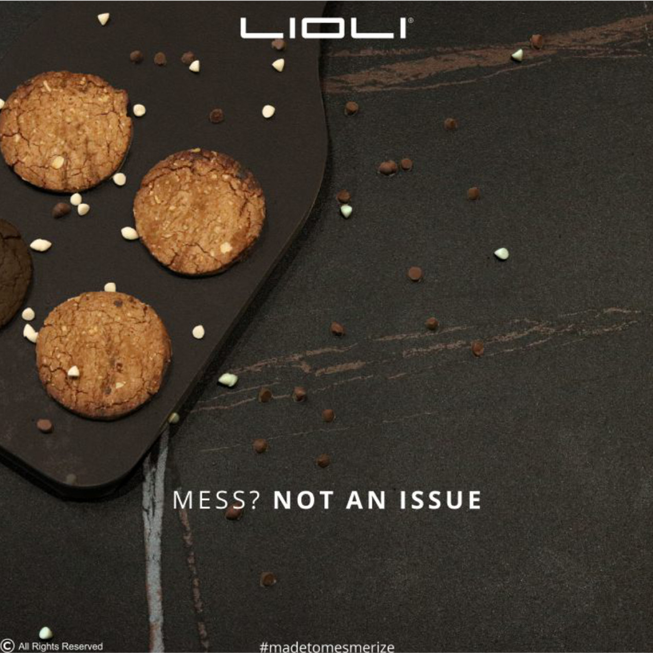
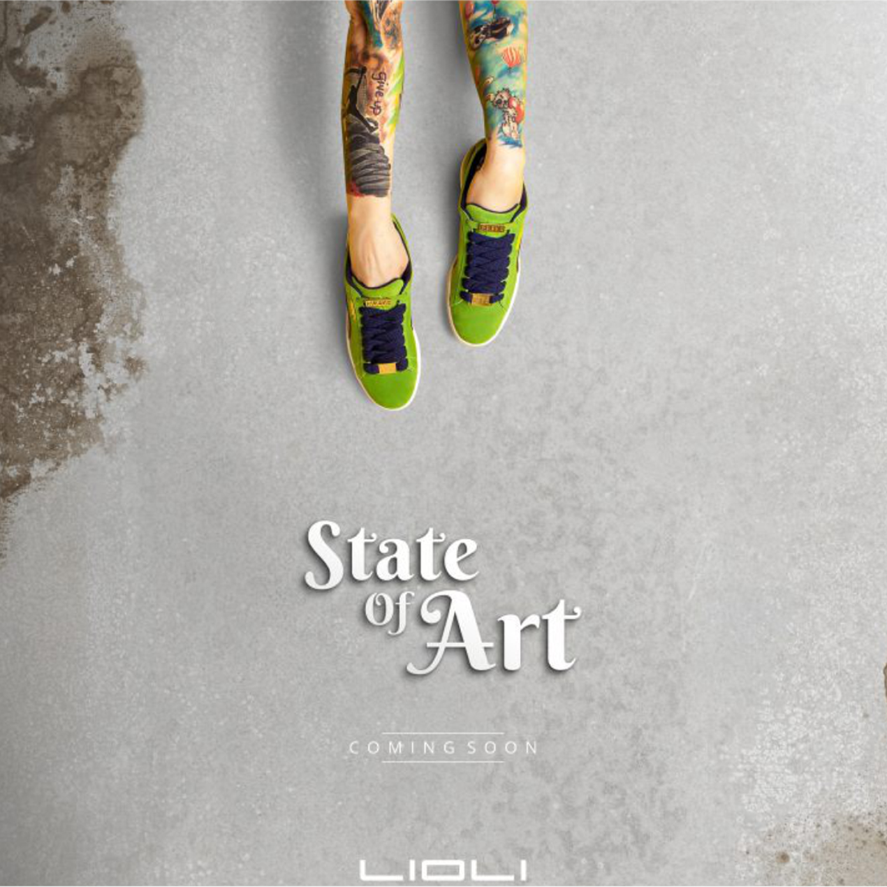
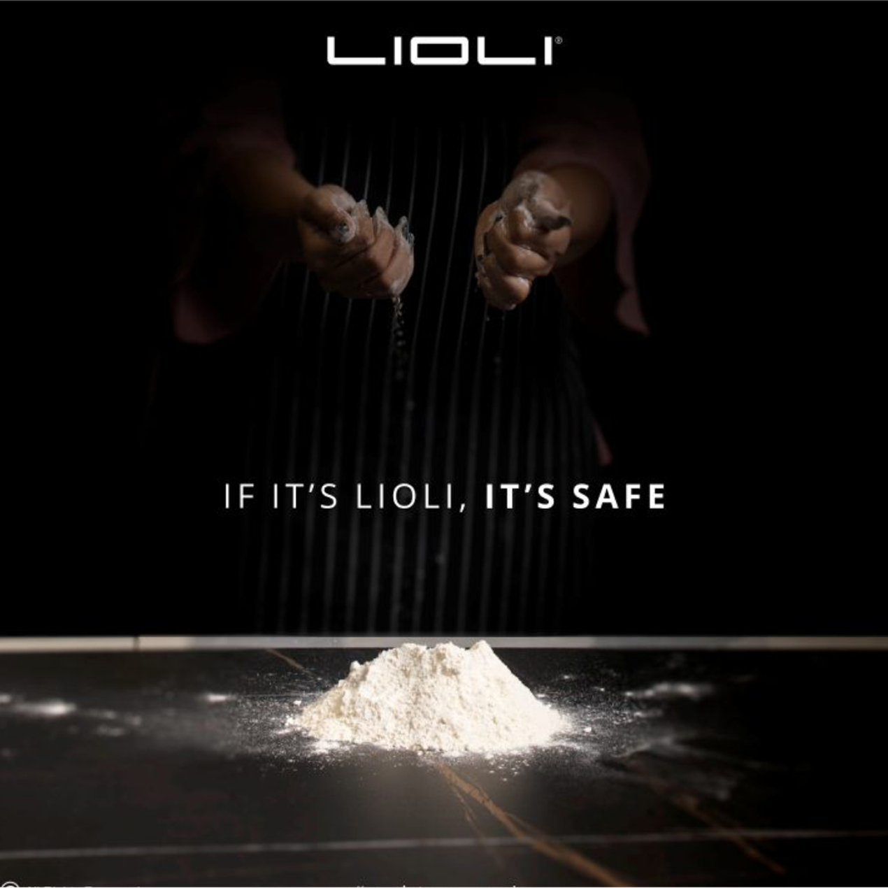
For this project, our role was to translate Lioli’s highly sophisticated surface identity into a premium packaging and physical brand experience. The brand’s visual communication—also reflected in the creatives you shared—uses minimal compositions, architectural imagery, dark luxury tones and concept-led messaging such as “State of Art” and “Let Us Lioli, It’s Safe.” The packaging therefore needed to carry the same refined personality instead of feeling like conventional industrial tile packaging.
The objective was to create a system that could communicate brand, collection, slab size, finish and technical information clearly while preserving Lioli’s high-end architectural positioning across warehouses, dealers, professional projects and international distribution.
The Challenge
Lioli’s portfolio includes large-format porcelain surfaces across different sizes, finishes, colours and design directions—from marble and stone interpretations to terrazzo, onyx and contemporary minimal surfaces. The challenge was to create packaging flexible enough to support this diversity while ensuring that every pack remained immediately recognizable as Lioli. Each collection required its own personality, but the overall portfolio could not become visually fragmented.
Large-format slab packaging also has demanding functional requirements. Product size, thickness, finish, quantity, batch identification and handling information must remain clear for factory teams, distributors, warehouses and installers. Lioli’s flagship 1600 × 3200 mm slabs alone are offered in 6 mm, 9 mm and 12 mm thicknesses, creating a need for accurate and quickly scannable technical communication.
At the same time, Lioli communicates itself as a premium, design-conscious architectural brand. The packaging therefore had to avoid excessive graphics and industrial clutter while still performing as a practical identification and logistics tool.
Our Solution
We developed a minimal, architecture-led packaging language that reflects Lioli’s wider communication style. Strong master-brand visibility, controlled typography, disciplined spacing and restrained graphic elements give the packaging a more sophisticated character, allowing the presentation to feel consistent with the premium porcelain surfaces inside.
A modular system was established for brand name, collection identity, slab dimensions, finish and technical specifications. Fixed information zones provide consistency and faster product identification, while controlled colour or texture cues allow individual collections and formats to differentiate themselves without losing the Lioli master identity.
The final approach was designed for scalability across existing and future slabs. Rather than creating isolated packaging for every surface, one flexible architecture can support different dimensions, thicknesses, finishes and collections—giving Lioli a consistent physical presence across manufacturing, warehousing, dealer networks, project sites and international distribution.
A closer look at the experience.
Let’s Build What’s Next.
Whether you’re building a new brand, improving your digital experience, scaling eCommerce, driving growth, automating operations, or solving a technology challenge, let’s talk about where you want to go—and what it will take to get there.