Motto

Project Overview
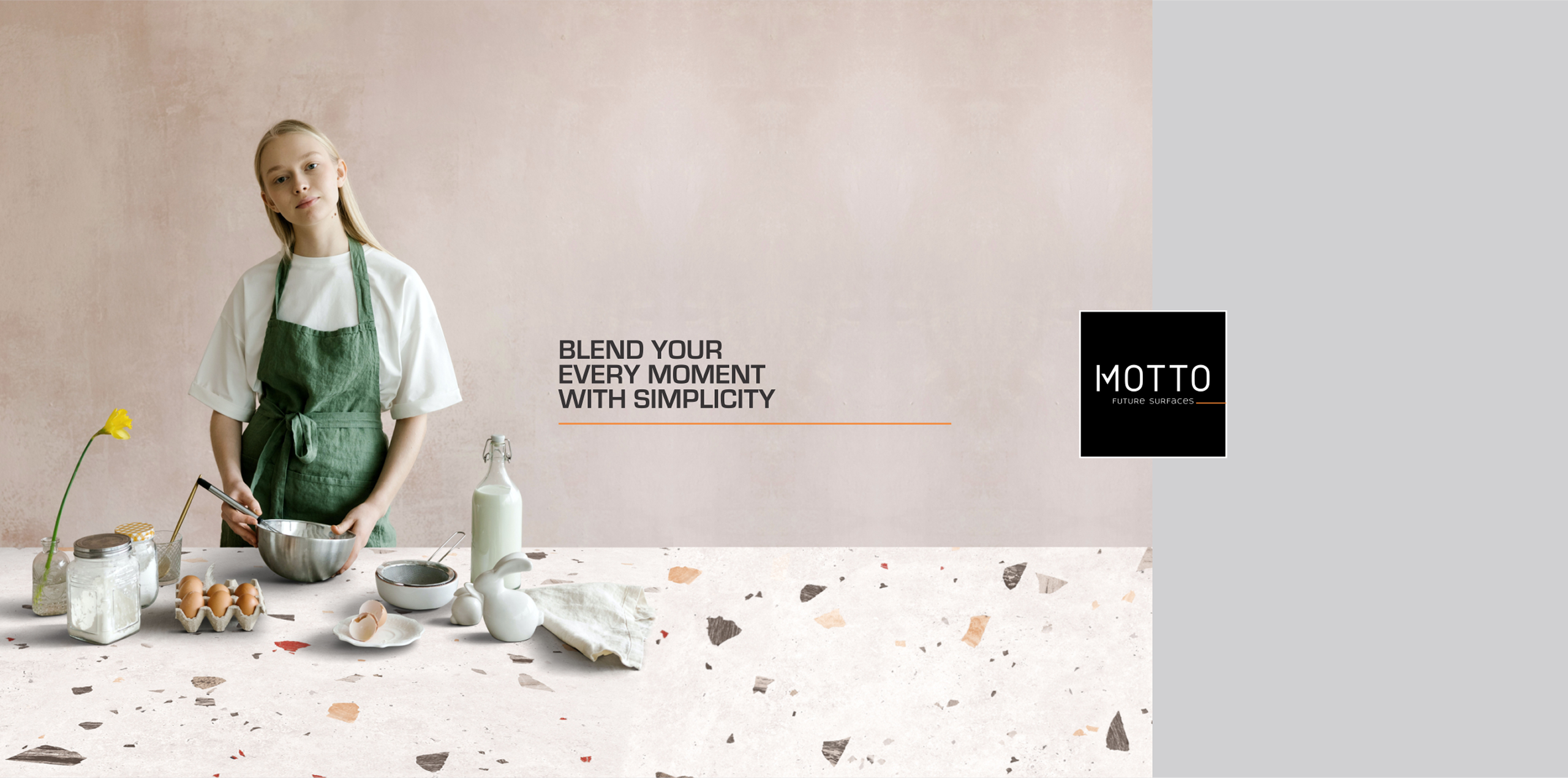
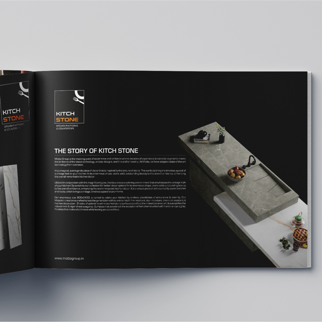
Motto Group is an Indian manufacturer and exporter of premium ceramic and vitrified surfaces, offering products for residential, commercial and architectural applications. Its portfolio spans Sintered Stone, Digital Wall Tiles, GVT, PGVT and Double Charge products, alongside large-format slabs and contemporary collections inspired by marble, stone, wood and terrazzo.
For this project, the objective was to translate Motto’s design-led philosophy into a packaging system capable of representing the brand before the actual surface is installed. Since tile and slab products travel through manufacturing facilities, warehouses, dealers, export channels and project sites, the packaging needed to combine premium visual presentation with practical product identification.
The design direction therefore focused on making every package feel consistent with Motto’s wider positioning around modern living, simplicity, architectural elegance and innovation, while creating a system flexible enough to support different collections, formats and future surface launches.
The Challenge
Motto has a highly diverse surface portfolio. Its collections range from minimal solid surfaces and natural stone interpretations to marble, wood and terrazzo-inspired designs, while formats extend from conventional tiles to large-format sintered stone slabs. The key challenge was creating packaging that could support this variety without allowing every product family to develop an unrelated identity.
Tile packaging also needs to communicate far more than visual branding. Information such as collection, size, finish, thickness, quantity, batch/shade identification, weight and handling instructions must remain clear for warehouses, dealers, installers and export partners. The challenge was to organise this technical content efficiently without making the package appear overly industrial or visually cluttered.
Finally, Motto serves a large international audience. Its corporate material states reach across 70+ countries and 2,500+ customers, meaning the packaging needed to remain understandable and professional across different markets while retaining a strong Indian master-brand identity.
Our Solution
We developed a minimal, architecture-led packaging language inspired by Motto’s contemporary brand communication. Strong master-brand visibility, restrained typography, generous spacing and controlled graphic elements create a cleaner presentation, allowing the packaging to feel consistent with the premium surfaces inside rather than behaving like conventional industrial shipping cartons.
A modular layout system was introduced to separate brand identity, collection name, product format and technical information into predictable visual zones. This makes information easier to scan while giving each collection enough flexibility to use its own colour, texture or visual cue. Terrazzo, marble, stone and other design families can therefore express different personalities while still looking unmistakably part of the Motto ecosystem.
The packaging architecture was also designed for scalability. As Motto continues adding new finishes, sizes and large-format surfaces, the same master system can be extended without redesigning the entire identity. This creates consistency across production, dealer presentation, export logistics and final customer interaction.
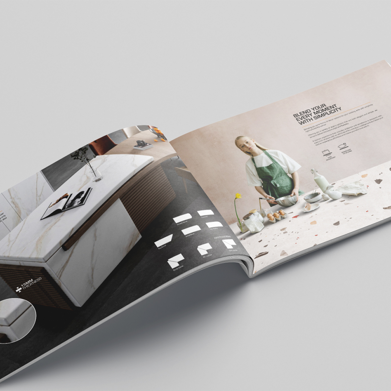
A closer look at the experience.

Let’s Build What’s Next.
Whether you’re building a new brand, improving your digital experience, scaling eCommerce, driving growth, automating operations, or solving a technology challenge, let’s talk about where you want to go—and what it will take to get there.