
Shafia
Project Overview
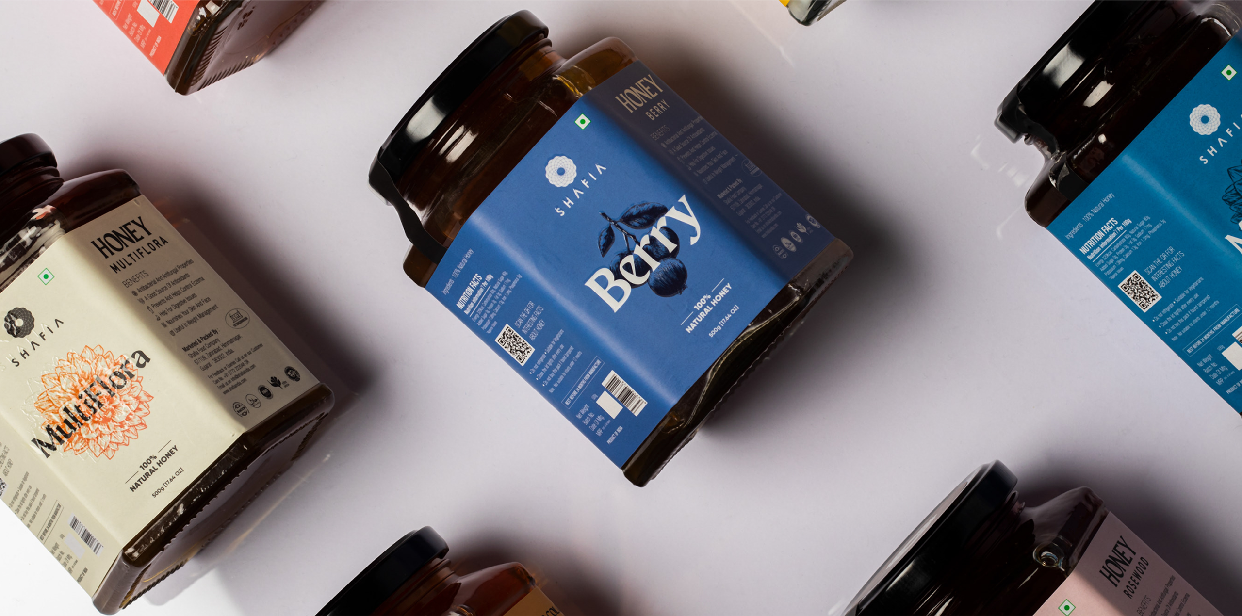
Shafia is an Indian honey brand focused on delivering pure and naturally sourced honey from different floral regions across India. Its portfolio extends from Multiflora, Rosewood, Himalayan and Litchi Honey to premium products such as Sidr Honey, Saffron Honey, Cashew with Honey, Almond with Honey and convenient Honey Blister Packs.
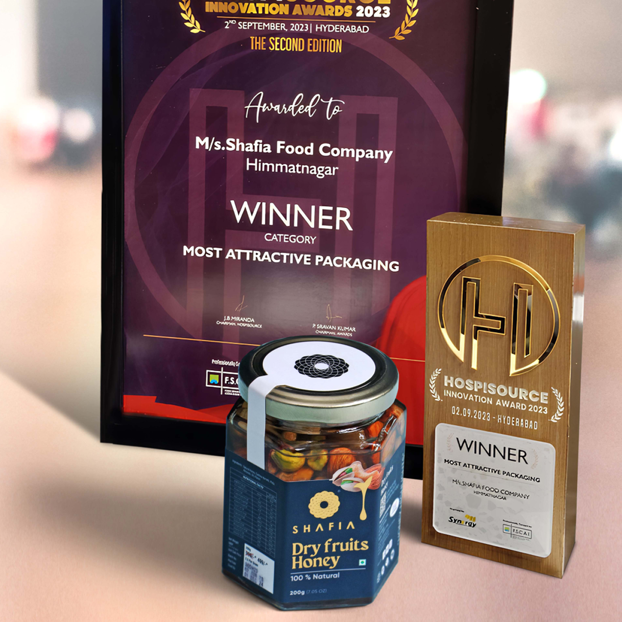
With a growing range of products and audiences spanning retail consumers, gifting, hospitality, distributors and international markets, Shafia needed packaging that could communicate more than simply the product name. The packaging had to visually express purity, natural origin, premium quality and the distinctive character of every honey variety.
Our objective was to develop a packaging system that could give Shafia stronger shelf presence while maintaining consistency across multiple SKUs, formats and future product extensions.
The Challenge
Shafia operates in a category where many honey brands rely on similar visual cues—golden colours, honeycombs, bees and generic natural imagery. The primary challenge was therefore to create packaging that felt unmistakably connected to honey and nature while still giving Shafia a distinctive, premium and contemporary shelf identity. The design needed to quickly communicate trust and purity without becoming visually overcrowded.
Another challenge was managing a diverse product portfolio. Different floral origins and premium combinations such as Litchi, Himalayan Multiflora, Sidr, Rosewood, Saffron, Almond and Cashew Honey needed their own identities while still looking like members of one Shafia family. Customers had to be able to recognise the brand first and differentiate the product variant immediately afterward.
The packaging also needed to work beyond regular retail shelves. Shafia serves domestic customers as well as hospitality, distribution, gifting, bulk and export requirements, meaning the visual system had to remain professional across different container formats and markets while leaving sufficient hierarchy for important food, product and regulatory information.
Our Solution
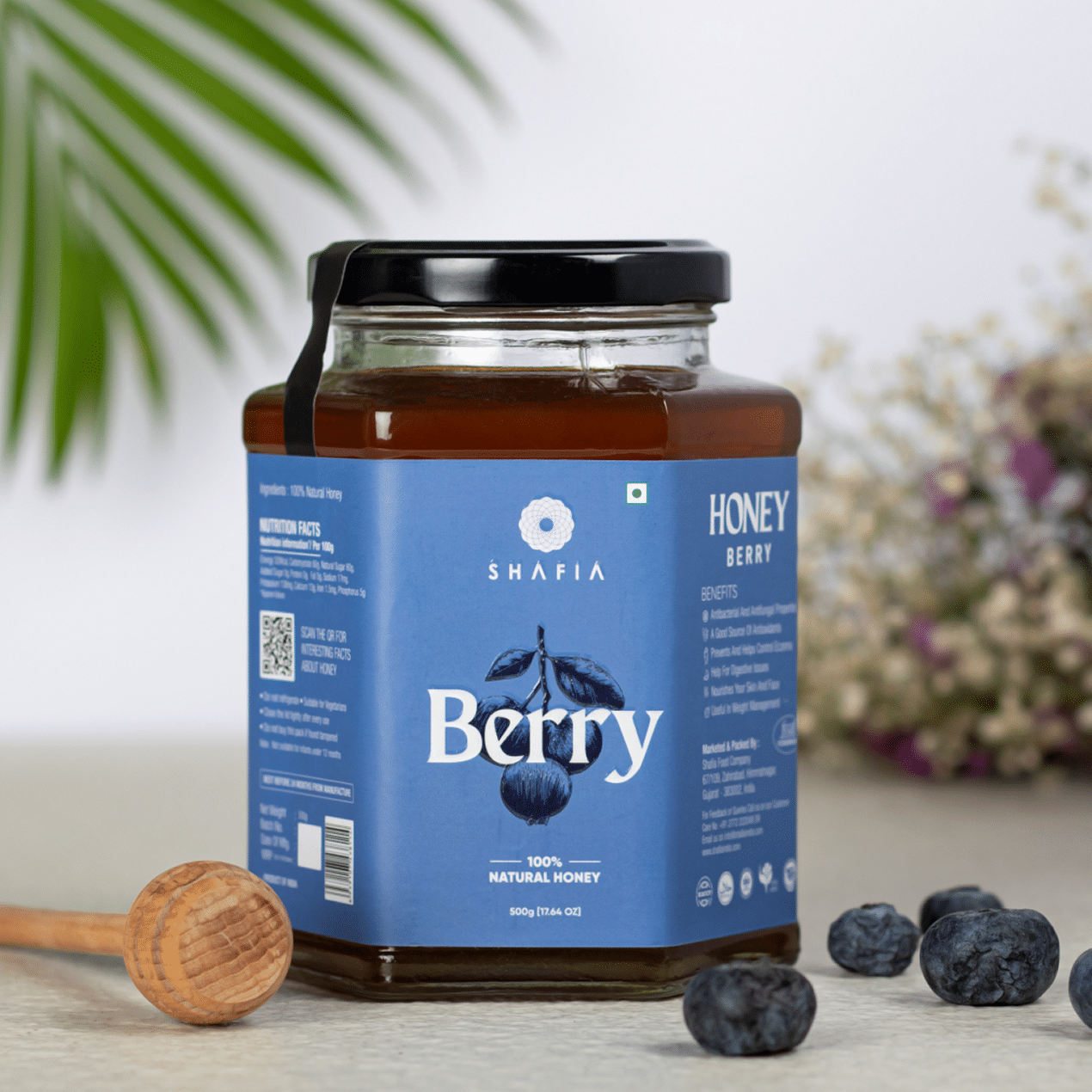
We developed a unified packaging language centred around purity, provenance and premium natural goodness. A strong brand hierarchy ensures that Shafia remains immediately recognizable, while carefully controlled typography, imagery, colours and visual elements give the packaging a cleaner and more contemporary appearance. Product information was organised so the consumer can quickly understand the brand, honey variety and key product distinction without unnecessary visual clutter.
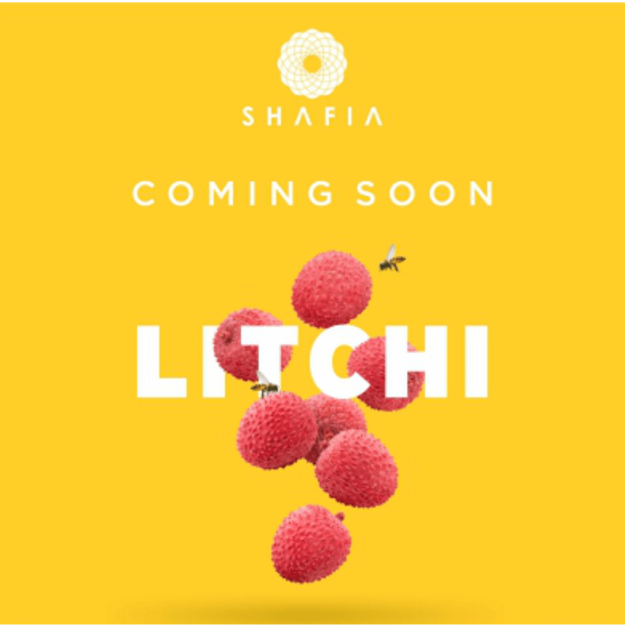
To manage the wider product portfolio, we created a flexible SKU differentiation system in which every honey variety could carry its own colour, flavour or floral personality while retaining a consistent master-brand structure. This makes products such as Litchi, Himalayan, Sidr and premium dry-fruit honey easier to distinguish on shelf without fragmenting Shafia’s overall identity.
The final system was designed with scalability in mind, allowing the visual identity to adapt across jars, premium products, gifting formats and other packaging applications. This created a stronger foundation for Shafia to introduce new honey varieties and formats while maintaining one recognizable, premium brand experience across retail and professional markets.
A closer look at the experience.
Let’s Build What’s Next.
Whether you’re building a new brand, improving your digital experience, scaling eCommerce, driving growth, automating operations, or solving a technology challenge, let’s talk about where you want to go—and what it will take to get there.