
Shatva

Project Overview
Shatva is an Ayurvedic health and wellness brand built around the philosophy of combining traditional herbal knowledge with research-focused modern formulation. Its product portfolio addresses multiple wellness needs including digestive health, immunity, liver care, mental wellness, muscle and joint care, colorectal wellness and other specialised health categories.
With products spanning different formulations and pack formats, Shatva required a packaging system that could communicate natural ingredients, Ayurvedic credibility, product purpose and professional healthcare positioning within a single recognisable brand identity.
The objective was to move away from the cluttered and overly traditional appearance commonly associated with Ayurvedic packaging and create a cleaner, more contemporary presentation that could build trust while still retaining Shatva’s connection with nature and herbal wellness.
The Challenge
The Ayurvedic wellness category is highly competitive, with many products using similar visual cues such as green palettes, herbs, leaves and traditional motifs. Shatva therefore needed packaging that would immediately communicate natural wellness and Ayurveda while still creating a distinctive identity strong enough to stand apart on pharmacy, clinic and retail shelves.
Another challenge was managing a broad product portfolio. Different products address very different wellness concerns, yet every pack still needed to clearly belong to the Shatva master brand. The packaging had to create a balance between brand consistency and SKU differentiation, allowing customers and healthcare professionals to recognise both Shatva and the individual product quickly.
The packs also contain important information such as product name, formulation type, ingredients, dosage or pack size and wellness application. The design therefore needed a strong information hierarchy that made essential communication easy to understand without making the front panel look clinical, crowded or intimidating.


Our Solution
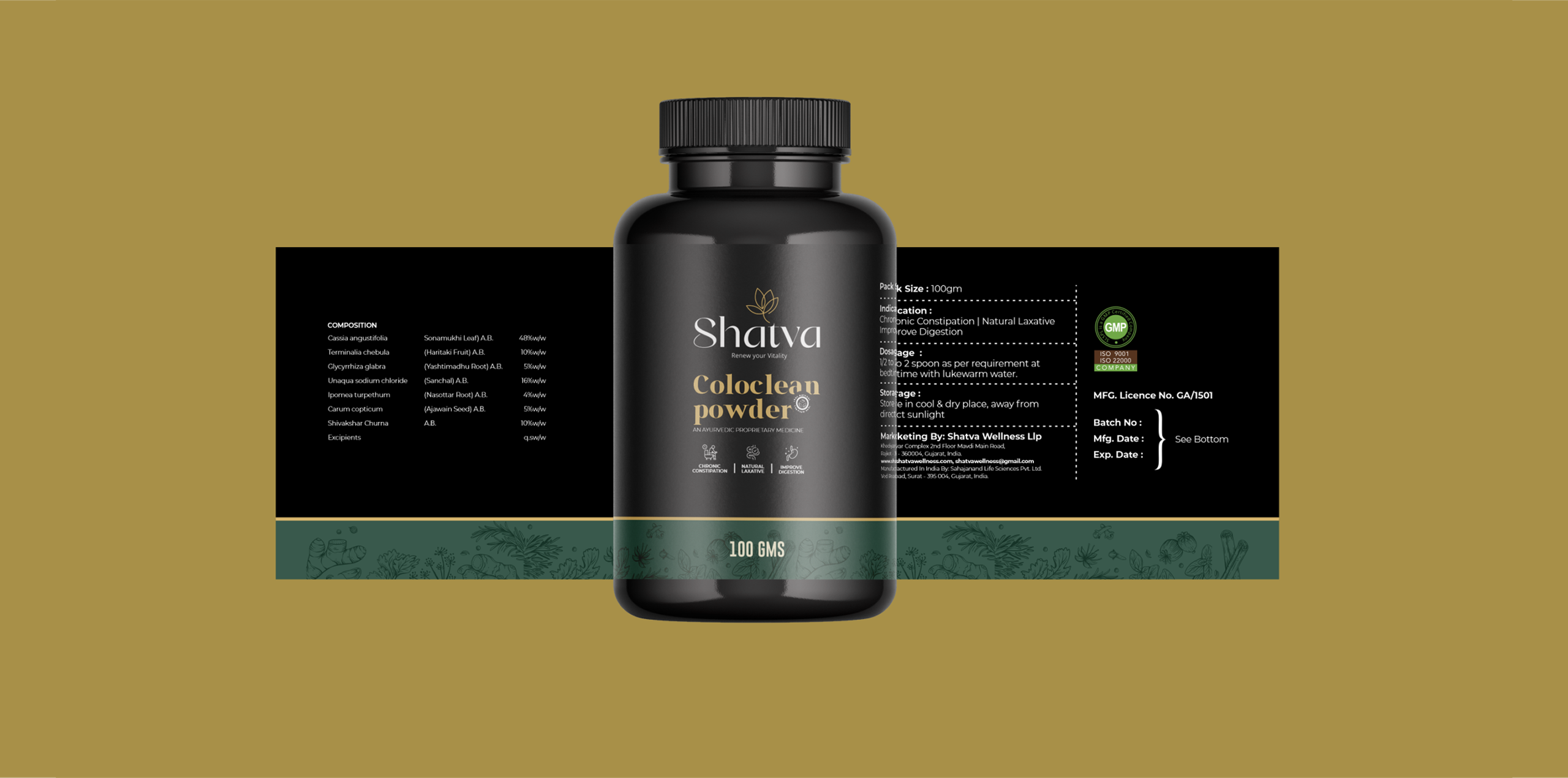
We developed a cohesive packaging system that combines Ayurvedic authenticity with a clean, contemporary healthcare aesthetic. A consistent Shatva brand zone, controlled typography and structured layout give every product a professional appearance, while natural visual cues retain the connection with herbal ingredients and traditional wellness.
To manage multiple products, we created a scalable SKU architecture in which each formulation can carry its own colour, supporting graphics or wellness cues while following the same master packaging structure. This makes individual products easier to distinguish while ensuring the entire range remains instantly recognisable as Shatva.
The information hierarchy was also simplified so that the brand, product name, wellness category and primary product communication receive clear priority. The resulting system can adapt across different formats—including capsules, powders and other herbal wellness products—without losing visual consistency, giving Shatva a stronger foundation for future product extensions.
A closer look at the experience.

Let’s Build What’s Next.
Whether you’re building a new brand, improving your digital experience, scaling eCommerce, driving growth, automating operations, or solving a technology challenge, let’s talk about where you want to go—and what it will take to get there.